Working With Panels
The information in this chapter describes how to use panels.
- I.4.1. Introducing Panels
- I.4.2. Managing Your Panels
- I.4.3. Panel Objects
- I.4.4. Launchers
- I.4.5. Menus
- I.4.6. Applets
- I.4.7. Drawers
- I.4.8. Other Panel Objects
I.4.1. Introducing Panels
A panel is an area on your desktop from which you can run applications and applets, and perform other tasks. When you start a session for the first time, the desktop contains the following panels:
- Menu Panel
- Edge panel at the bottom of the desktop
The following sections describe these panels.
- I.4.1.1. Menu Panel
- I.4.1.2. Bottom Edge Panel
I.4.1.1. Menu Panel
The Menu Panel stretches the full length of the top edge of your screen. The Menu Panel includes textual rather than graphical menus. Figure I.4-1 shows the Menu Panel. Your system administrator might have set your default Menu Panel according to your local requirements, so you might see a slightly different Menu Panel.

The typical Menu Panel contains the following objects:
| Object | Description |
|---|---|
| menu | The menu contains the standard GNOME applications. |
| menu | The menu provides menu items that relate to the current status of your desktop. |
| GNOME Terminal launcher | Click on this button to start a GNOME Terminal. GNOME Terminal provides access to a UNIX command line. |
| Volume Control applet | Volume Control enables you to control the volume of the speaker on your system. |
| Clock applet | Clock shows the current time. Click on the time readout to display a menu of clock commands. |
Window list icon |
The window list is a list of all open windows on the desktop. To give focus to a window click on the icon at the extreme right of the Menu Panel then choose the window. |
Unlike other types of panel, you can only have one Menu Panel at a time on your desktop.
I.4.1.2. Bottom Edge Panel
On startup, an edge panel stretches the full length of the bottom edge of the desktop. Figure I.4-2 shows a typical bottom edge panel. Your system administrator might have set your default bottom edge panel according to your local requirements, so you might see a slightly different bottom edge panel.

The bottom edge panel contains the following applets:
- Window List: Displays a button for each window that is open. Window List enables you to minimize and restore windows.
- Workspace Switcher: Enables you to navigate between your workspaces.
You can change the behavior and appearance of your bottom edge panel to suit your requirements. You can also add or remove objects from your bottom edge panel. You can create multiple panels, and choose different properties, objects, and backgrounds for each panel. You can also hide panels.
I.4.2. Managing Your Panels
The following sections describe how to manage your panels.
- I.4.2.1. To Create a Panel
- I.4.2.2. Interacting With a Panel
- I.4.2.3. To Move a Panel
- I.4.2.4. To Hide a Panel
- I.4.2.5. To Modify Panel Properties
- I.4.2.6. To Delete a Panel
I.4.2.1. To Create a Panel
You can create different types of panels to customize your desktop. Table I.4-1 lists the types of panel that you can create, and their characteristics.
| Panel Type | Snap Behavior | Size |
|---|---|---|
| Corner panel | Snaps to one of the edges of the screen, but can only snap to the center or the corner of the edge. | Stretches as much as required to display the objects on the panel. |
| Edge panel | Snaps to one of the edges of the screen. The startup panel at the bottom of the desktop is an example of an edge panel. | Stretches the full length of the edge that the panel snaps to. |
| Floating panel | Does not snap to anything. You can place a floating panel anywhere on your desktop. | Stretches as much as required to display the objects on the panel. |
| Menu Panel | Snaps to the top edge of the screen. You can not move the Menu Panel. | Stretches the full length of the top edge of the screen. You can only have one Menu Panel on your desktop. |
| Sliding panel | Snaps to one of the edges of the screen, can snap to any point on the edge. | Stretches as much as required to display the objects on the panel. |
To create a panel perform the following steps:
Right-click on a vacant space on any panel, then choose from the panel popup menu.
-
Choose the type of panel that you want to create. The new panel is added to the desktop. The new panel contains no objects, except for a Menu Panel.
You can customize the new panel to suit your preferences.
I.4.2.2. Interacting With a Panel
To interact with a panel, you must left-click, middle-click, or right-click on a vacant space on the panel. You can also middle-click or right-click on one of the hide buttons to select the panel, if the panel has no vacant space. If the hide buttons are not visible on a panel, modify the properties of the panel so that the hide buttons are visible.
You use the mouse buttons to interact with a panel in the following ways:
| Middle-click | Enables you to grab a panel, then drag the panel to a new location. |
| Right-click | Opens the panel popup menu. |
I.4.2.3. To Move a Panel
You can move panels to different locations on your desktop. To move a panel, middle-click and hold on any vacant space on the panel, then drag the panel to the new location.
When you drag a floating panel, the panel follows the mouse pointer. The panel does not snap to any part of the desktop. When you drag a corner panel, an edge panel, or a sliding panel, the panel snaps to the edge of the screen.
You can not move the Menu Panel.
I.4.2.4. To Hide a Panel
You can hide or show a panel on your desktop, except for the Menu Panel. To hide a panel, use a hide button. If the hide buttons are not visible on a panel, modify the preferences of the panel so that the hide buttons are visible.
Hide buttons are at either end of a panel. The hide buttons contain an optional arrow icon. The following illustration shows hide buttons.
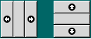
To hide a panel, click on one of the hide buttons. The panel reduces in the direction of the arrow on the hide button. The hide button at the other end of the panel remains visible.
To show a hidden panel again, click on the visible hide button. The panel expands in the direction of the arrow on the hide button. Both hide buttons are now visible.
You can set a panel to autohide. When you set autohide, the panel hides automatically when the mouse is not pointing to the panel. The panel reappears when you point to the part of the screen where the panel resides. To set your panel to autohide, modify the preferences of the panel.
On a corner panel, the behavior of the hide buttons is slightly different. If the panel is in one of the corners of the screen, you can use the hide buttons as follows:
- To hide the panel, click the hide button that is closest to the edge of the screen, as normal.
- To move the panel to the opposite corner of the screen, click the hide button that is farthest from the edge of the screen.
I.4.2.5. To Modify Panel Properties
To modify preferences for all panels, choose , then make the changes that you require. For example, you can specify various settings related to the appearance and behavior of panel objects.
You can also modify properties for each individual panel. You can change the features for each panel, such as the type of the panel, the hide behavior, and the visual appearance.
You cannot modify properties for the Menu Panel.
To modify the properties of a panel perform the following steps:
-
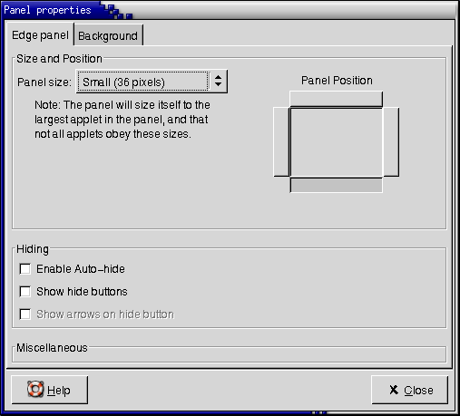
Right-click on a vacant space on the panel, then choose to display the Panel Properties dialog. The following figure shows the Panel Properties dialog for the edge panel at the bottom of your desktop.
The Panel Properties dialog contains the following tabbed sections:
- Panel
- Background
-
To modify panel size, position, and hiding properties, click on the Panel tab. The following table describes the dialog elements on the Panel tabbed section:
Dialog Element Description Panel size Choose the size of the panel. Panel position Choose the position of the panel on your desktop. Click on the required position for the panel. Panel window level Select the level or layer at which you want the panel to appear. Select from one of the following options:
- Default (from global preferences) : Select this option to use the default setting that is specified in .
- Below other windows: Select this option if you want the panel to appear below windows.
- Normal: Select this option if you want the panel to appear at the same level as windows.
- Above other windows: Select this option if you want the panel to appear above windows.
Orient panel horizontally Floating panel only. Select this option to display the panel horizontally. Orient panel vertically Floating panel only. Select this option to display the panel vertically. Top left corner's position Floating panel only. Use the X and Y spin boxes to specify the coordinates for the top-left corner of the panel. Offset from screen edge Sliding panel only. Use this spin box to specify the distance between your panel and the edge of the screen, in pixels. Enable Auto-hide Select this option to enable autohide. Show hide buttons Select this option to display hide buttons on your panel. Show arrows on hide button Select this option to display arrows on the hide buttons, if the hide button is enabled. Avoid this panel when maximizing windows Select this option if you do not want to overlap the panel when you maximize windows. -
To modify the panel background, click on the Background tab. The Background tabbed section contains the following elements:
Dialog Element Description Background Type Choose the type of background for the panel. The choices are as follows:
- Standard: The standard background type. The standard background depends on the settings in .
- Color: Enables you to choose a color for the panel background.
- Pixmap: Enables you to choose an image for the panel background.
Color If Background Type is Color, click on the button to display the color selector dialog. Choose the color that you require from the color selector dialog. Image If Background Type is Pixmap, choose the image to use on the background of the panel. Specify the following settings for the image background: Don't scale image to fit Select this option to tile the background image to fit the panel background. Scale image Select this option to scale the background image to fit the panel background. The width-to-height ratio of the image is retained. Stretch image Select this option to stretch the background image to fit the panel background. The width-to-height ratio of the image is not retained. Rotate image for vertical panels Select this option to rotate the background image on a vertical panel. You can also drag a color or image on to a panel to set the color or image as the background of the panel. For more information, see Section I.4.2.5.1 ― To Drag a Color or Image to the Background of a Panel.
Click to apply the changes and close the Panel Properties dialog.
I.4.2.5.1. To Drag a Color or Image to the Background of a Panel
You can drag a color or image on to a panel to set the color or image as the background of the panel. You can drag a color or image from many applications. For example, you can drag a color from the Nautilus file manager to a panel to set the color as the background of the panel. You can also drag a color from any color selector dialog.
You can drag an image to a panel to set the image as the background of the panel. You can also drag pattern images from the Nautilus file manager application to set the background of the panel.
I.4.3. Panel Objects
This section describes the objects that you can add to your panels, and use from your panels.
- I.4.3.1. Interacting With Panel Objects
- I.4.3.2. To Add an Object to a Panel
- I.4.3.3. To Modify the Properties of an Object
- I.4.3.4. To Move a Panel Object
- I.4.3.5. To Remove a Panel Object
I.4.3.1. Interacting With Panel Objects
You use the mouse buttons to interact with a panel object in the following ways:
| Left-click | Launches the panel object. |
| Middle-click | Enables you to grab an object, then drag the object to a new location. |
| Right-click | Opens the panel object popup menu. |
You interact with applet panel objects in a different way. For more information, see Section I.4.6.2 ― To Select an Applet.
I.4.3.2. To Add an Object to a Panel
You can add an object to a panel in several ways, as follows:
-
From the panel popup menu
Right-click on a vacant space on a panel to open the panel popup menu. The panel popup menu contains an submenu. The submenu enables you to add the following objects to your panels:
- Launchers
- Menus
- Accessory applets
- Amusement applets
- Internet applets
- Multimedia applets
- Utility applets
- Drawers
- Other panel objects
-
From any menu
When you right-click on a launcher in any menu, a popup menu for the launcher opens. You can use this popup menu to add the launcher to a panel.
You can also drag menus, launchers, and applets from menus to panels.
-
From the file manager
Each launcher and applet corresponds to a .desktop file. You can drag the .desktop file on to your panels to add the launcher or applet to the panel.
Each menu corresponds to a directory. You can drag the directory on to your panels to add the directory to the panel as a menu object.
I.4.3.3. To Modify the Properties of an Object
Some panel objects have a set of associated properties. The properties are different for each type of object. The properties specify details such as the following:
- The command that starts a launcher application.
- The location of the source files for a menu.
- The icon that represents the object.
To modify the properties of an object perform the following steps:
-
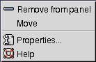
Right-click on the object to open the panel object popup menu, as shown in Figure I.4-3.
Choose . Use the Properties dialog to modify the properties as required. The properties in the Properties dialog depend on which object you select in step 1.
Click to apply the changes, then close the Properties dialog.
I.4.3.4. To Move a Panel Object
You can move panel objects within a panel, and from one panel to another panel. You can also move objects between panels and drawers.
To move a panel object, middle-click and hold on the object and drag the object to a new location. When you release the middle mouse button, the object anchors at the new location.
Alternatively, you can use the panel object popup menu to move an object, as follows:
- Right-click on the object to open the panel object popup menu.
- Choose .
- Point to the new location for the object, then click any mouse button to anchor the object to the new location. This location can be on any panel that is currently on your desktop.
Movement of a panel object affects the position of other objects on the panel. To control how objects move on a panel, you can specify a movement mode. To specify the movement mode, press one of the following keys as you move the panel object:
| Key | Movement Mode | Description |
|---|---|---|
| No key | Switched movement | The object swaps places with other panel objects. Switched movement is the default movement mode. |
| Alt key | Free movement | The object jumps over other panel objects into the next vacant space on the panel. |
| Shift key | Push movement | The object pushes other panel objects further along the panel. |
I.4.4. Launchers
When you click on a launcher, you initiate one of the following actions:
- Start a particular application.
- Execute a command.
- Open a folder in a file manager window.
- Open a browser at a particular URL.
You can find launchers in the following places on the desktop:
- Panels: On panels, launchers are represented by icons.
- Menus: On menus, launchers are represented by menu items with an icon.
You can modify the properties of a launcher. For example, the properties of a launcher include the name of the launcher, the icon that represents the launcher, and how the launcher runs.
- I.4.4.1. To Add a Launcher to a Panel
- I.4.4.2. To Modify the Properties of a Launcher
I.4.4.1. To Add a Launcher to a Panel
You can add a launcher to a panel in one of the following ways:
-
From the panel popup menu
To create a new launcher, right-click on any vacant space on the panel to open the panel popup menu. Choose . A Launcher Properties dialog is displayed. For more information on how to complete this dialog, see Section I.4.4.1.1 ― To Create a Launcher With the Launcher Properties Dialog.
Alternatively, to add an existing launcher to the panel, choose from the panel popup menu. Choose the launcher that you want to add from the menu.
-
From any menu
To add a launcher to a panel from any menu, perform one of the following steps:
- From the panel where you want the launcher to reside, open the menu that contains the launcher. Right-click on the title of the launcher. Choose .
- Open a menu that contains the launcher. Drag the launcher on to the panel.
-
From the file manager
To add a launcher to a panel from the file manager, find the .desktop file for the launcher in your file system. To add the launcher drag the .desktop file to the panel.
I.4.4.1.1. To Create a Launcher With the Launcher Properties Dialog
To create a launcher with the Launcher Properties dialog perform the following steps:
-
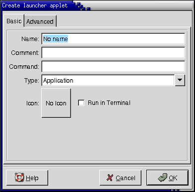
Right-click on any part of a panel to open the panel popup menu. Choose to display the Launcher Properties dialog. The dialog displays the Basic tabbed section, as shown in the following figure:
-
Enter the properties of the launcher in the dialog. The following table describes the dialog elements on the Basic tabbed section:
Dialog Element Description Name Use this text box to specify the name of the launcher. You can use the Advanced tab to add translations of the name. This name is the name that appears when you add the launcher to a menu or to the desktop. Generic name Information to be supplied in a future release. Comment Use this text box to specify a short description of the launcher. The comment is displayed as a tooltip when you point to the launcher icon on the panel. You can use the Advanced tabbed section to add translations of the comment. Command Use this field to specify a command to execute when you click on the launcher.
If the launcher type is URL, use this text box to specify a URL to access when you choose the launcher.
Type Use this drop-down combination box to specify the type of launcher. Choose from the following:
- Application: Choose this list item to create a launcher that starts an application.
- FSDevice: Information to be supplied in a future release.
- Link: Information to be supplied in a future release.
- MimeType: Information to be supplied in a future release.
- Service: Information to be supplied in a future release.
- ServiceType: Information to be supplied in a future release.
Icon Choose an icon to represent the launcher. To choose an icon, click on the button. An icon selector dialog is displayed. Choose an icon from the dialog. Alternatively, to choose an icon from another directory, click . When you choose an icon, click . Run in Terminal Select this option to run the application or command in a terminal window. Choose this option for an application or command that does not create a window in which to run. -
To set advanced properties for the launcher, click on the Advanced tab. The Launcher Properties dialog displays the Advanced tabbed section, as shown in the following figure.
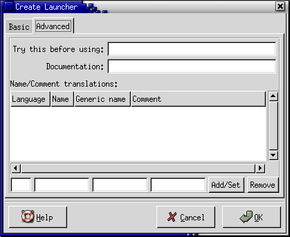
-
Enter the advanced properties of the launcher in the dialog. The following table describes the dialog elements on the top part of the Advanced tabbed section:
Dialog Element Description Try this before using Enter a command here to check before starting the launcher. If the command is executable and is in your path, the launcher appears on the panel. Documentation This field is not currently in use. -
You can also add a translation of the Name and Comment fields from the Basic tabbed section. To add a translation, enter the details of the translation in the Name/Comment translations table as follows:
Field Description First field Enter the two-letter code for the language for which you want to add a translation. Second field Enter the translation of the Name of the launcher. Third field Enter the translation for the Comment for the launcher. Then click on the button.
To edit a translation, select the translation. The translated text appears in the lower part of this dialog. Edit the fields as required, then click on the button.
To remove a translation, select the translation, then click on the button.
To create the launcher and close the Launcher Properties dialog, click .
I.4.4.2. To Modify the Properties of a Launcher
To modify the properties of a launcher perform the following steps:
- Right-click on the launcher to open the panel object popup menu.
- Choose . Use the Launcher Properties dialog to modify the properties as required. For more information on the Launcher Properties dialog, see Section I.4.4.1.1 ― To Create a Launcher With the Launcher Properties Dialog.
- Click to apply your changes, then close the Launcher Properties dialog.
I.4.5. Menus
You can add the following types of menu to your panels:
System menus: System menus contain the standard applications and tools that you can use on your desktop. The menu and menu are system menus. To add a system menu to a panel, right-click on a launcher in the menu, then choose .
-
: The is your primary menu. You can access almost all of the applications, commands, and configuration options on your desktop from the . To add a to a panel, right-click on any vacant space on the panel to open the panel popup menu. Choose . You can add as many objects to your panels as you want. By default, the is represented on panels by a stylized footprint icon, as follows:

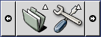
Menus that you add to your panels are represented by an icon with an arrow. The arrow indicates that the icon represents a menu or drawer. Figure I.4-4 shows how menus typically appear on panels.
For more information on menus, see Chapter I.5 ― Working With Menus.
I.4.6. Applets
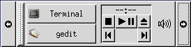
A applet is a small application whose user interface resides within a panel. You use the applet panel object to interact with the applet. For example, the following figure shows the following applets, from left to right:
- Window List: Displays the windows currently open on your system.
- CD Player: Enables you to control the compact disc player on your system.
- Volume Control: Enables you to control the volume of the speaker on your system.
- I.4.6.1. To Add an Applet to a Panel
- I.4.6.2. To Select an Applet
- I.4.6.3. To Modify Preferences for an Applet
I.4.6.1. To Add an Applet to a Panel
You can add an applet to a panel in the following ways:
-
From the panel popup menu
Right-click on any vacant space on the panel to open the panel popup menu. Choose , then choose the applet that you want to add from one of the following submenus:
-
From any menu
Open any menu that contains the applet, then drag the applet on to the panel.
I.4.6.2. To Select an Applet
To modify the properties of an applet, you must first right-click on the applet to display the panel object popup menu. To move an applet, you must middle-click on the applet. Some restrictions apply on where you can click on an applet in order to display the panel object popup menu or to move the applet, as follows:
- Some applets have popup menus of applet-specific commands that open when you right-click on particular parts of the applet. For example, the Window List applet has a vertical handle on the left side, and buttons that represent your windows on the right side. To open the panel object popup menu for the Window List applet, you must right-click on the handle. If you right-click on a button on the right side, a popup menu for the button opens.
- Some applets have areas that you cannot use to select the applet. For example, the Command Line applet has a field in which you enter commands. You can not middle-click or right-click on this field to select the applet. Instead, middle-click or right-click on another part of the applet.
I.4.6.3. To Modify Preferences for an Applet
To modify the preferences for an applet perform the following steps:
- Right-click on the applet to open the panel object popup menu.
- Choose . Use the Preferences dialog to modify the preferences as required. The preferences for applets vary depending on the applet.
- Click to apply your changes, then close the Preferences dialog.
I.4.7. Drawers
A drawer is an extension of a panel. You can open and close a drawer in the same way that you can show and hide a panel. A drawer can contain all panel objects, including launchers, menus, applets, other panel objects, and other drawers. When you open a drawer, you can use the objects in the same way that you use objects on a panel.
The following figure shows an open drawer that contains two panel objects.
The arrow on the drawer icon indicates that the icon represents a drawer or menu.
You can add, move, and remove objects from drawers in the same way that you add, move, and remove objects from panels.
- I.4.7.1. To Open and Close a Drawer
- I.4.7.2. To Add a Drawer to a Panel
- I.4.7.3. To Add an Object to a Drawer
- I.4.7.4. To Modify Drawer Properties
I.4.7.1. To Open and Close a Drawer
To open a drawer, click on the drawer object in a panel. You can close a drawer in the following ways:
- Click on the drawer.
- Click on the drawer hide button.
I.4.7.2. To Add a Drawer to a Panel
You can add a drawer to a panel in the following ways:
-
From the panel popup menu
Right-click on any vacant space on the panel to open the panel popup menu. Choose .
-
From any menu
You can add a menu as a drawer object to a panel.
To add a menu as a drawer to a panel, open the menu from the panel. Right-click on any launcher in the menu, then choose .
I.4.7.3. To Add an Object to a Drawer
You add an object to a drawer in the same way that you add objects to panels. For more information, see Section I.4.3.2 ― To Add an Object to a Panel.
I.4.7.4. To Modify Drawer Properties
To modify preferences for all panels and drawers, choose , then make the changes that you require. For example, you can select various options related to the appearance and behavior of objects on panels and drawers. You can also select options that relate to drawers only. For example, you can select an option to close your drawers when you click on a launcher in the drawer.
You can also modify other properties for each individual drawer. You can change features for each drawer, such as the visual appearance of the drawer and whether the drawer has hide buttons.
To modify properties for a drawer perform the following steps:
Right-click on the drawer to open the panel object popup menu.
-
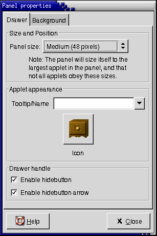
Choose to display the Panel Properties dialog. The dialog displays the Drawer tabbed section, as shown in the following figure.
-
Select the properties for the drawer in the dialog. The following table describes the elements on the Drawer tabbed section:
Dialog Element Description Panel size Select the size of the drawer. Panel window level Select the level or layer at which you want the drawer to appear. Select from one of the following options:
- Default (from global preferences): Select this option to use the default setting that is specified in the Desktop Preferences. To view the default setting, choose .
- Below other windows: Select this option if you want the panel to appear below windows.
- Normal: Select this option if you want the panel to appear at the same level as windows.
- Above other windows: Select this option if you want the panel to appear above windows.
Tooltip/Name Use this text box to specify a name for the drawer. The name appears as a tooltip when you point at the drawer on the panel. Icon Choose an icon to represent the drawer. Click on the button to display an icon selector dialog. Choose an icon from the dialog. Alternatively, click to choose an icon from another directory. When you choose an icon, click . Enable hide button Select this option to display a hide button when the drawer opens. Enable hide button arrow Select this option to display an arrow on the hide button if the hide button is enabled. You can use the Background tabbed section to set the background for the drawer. For information on how to complete the Background tabbed section, see the step on this topic in Section I.4.2.5 ― To Modify Panel Properties. You can also drag a color or image on to a drawer to set the color or image as the background of the drawer. For more information, see Section I.4.2.5.1 ― To Drag a Color or Image to the Background of a Panel.
Click to apply your changes, then close the Panel Properties dialog.
I.4.8. Other Panel Objects
Your panels can include other panel objects that you can use to perform special tasks. You can add the following panel objects to your panels:
- Log Out button
- Lock Screen button
To add a panel object to a panel perform the following steps:
- Right-click on any vacant space on the panel, then choose from the panel popup menu.
- Choose the object you want to add to the panel.
- I.4.8.1. Log Out Button
- I.4.8.2. Lock Screen Button
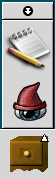
I.4.8.1. Log Out Button
The button begins the process to log out of a GNOME session.
To log out of your session or shut down your system, click on the button.
I.4.8.2. Lock Screen Button
The button locks your screen and starts a screensaver. To access your session again, you must enter your password. To lock your screen correctly, you must have a screensaver enabled.
Right-click on the button to open a popup menu of screensaver-related commands. Table I.4-2 describes the commands that are available from the popup menu.
| Menu Item | Function |
|---|---|
| Starts the screensaver immediately, but does not lock the screen. | |
| Locks the screen immediately. This command performs the same function as when you click on the button. | |
| Kills the screensaver process. After you kill the screensaver process, you can not lock your screen. | |
| Kills and restarts the screensaver process. Use this command after you change your password. When you restart the screensaver process, to use your new password with the screensaver. | |
| Displays an XScreenSaver dialog that you can use to configure the screensaver. For information on how to configure your screensaver, see Section I.3.2.2 ― To Set a Screensaver. |