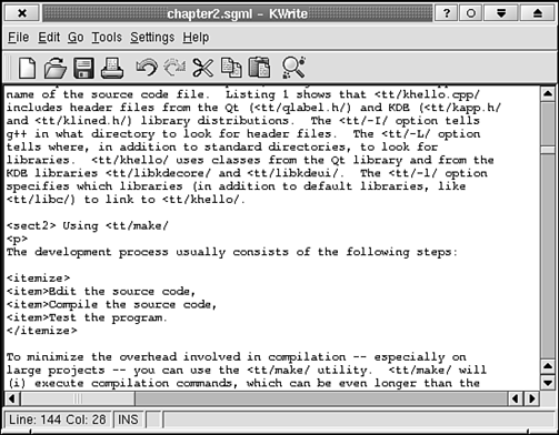
Take a look at Figure 5.1. It shows a prototypical example (KWrite) of a document-centric user interface. This sort of interface is used by applications on all the well-known desktops: KDE, CDE, GNOME, Windows, MacOS, OS/2, BeOS, and so on. The KDE incarnation (as well as others) of the interface includes a menubar, one or more toolbars, a statusbar, and a client area, as you have already learned in Chapter 2, "A Simple KDE Application." KDE offers standard widgets that draw and manage all these, except for the client area. The client area varies, depending on what information is being presented. More detailed standards govern the use of these widgets than those that are presented in this chapter. For example, Chapter 6, "KDE Style Reference," discusses where to place common and application-specific menubar and toolbar entries. The techniques involved in laying out the menubar and toolbar are discussed in the following sections of this chapter. The menubar and the toolbar are often discussed together because they provide access to all your applications' functions. Typically, in fact, the toolbar offers a subset of the menubar's functions. The menubar lists all the functions available to the user and categorizes them under a small number of headings. There are standard menu headings, such as File, Edit, and Help, and also standard menu entries, such as Open…, Save… and Quit. To access the menu entries' functions, the user selects a menu either by first clicking the heading with the mouse or by typing the key combination of Alt and a specially designated letter in the heading (such as the F in File to open the menu). Then the menu entry can be chosen by clicking it with the mouse or by pressing a specially designated letter (indicated by an underline in the entry text). Menu entries can also be accessed by an accelerator. This is a key combination of Ctrl+(some key) that activates a function directly, bypassing the pull-down menu. For example, Ctrl+S saves a document. Accelerators are available whenever the focus is somewhere in the main window. Only the most commonly used functions have accelerators associated with them. Menubar entries are one UI representation of actions, discussed in the next section, "Creating and Manipulating Actions." You will rarely, if ever, need to access the menubar widget directly. | |
Toolbars give quick access to frequently used functions listed in the menus on the menubar, such as Open, Save, Print, and so on. The user accesses these functions via buttons, line editors, or menus attached to buttons. Unlike the menubar, more than one toolbar can be created. Each toolbar can be used to collect a different set of functions. Certain sets of functions may be appropriate only at certain times; therefore, toolbars can be hidden and shown (as needed) by the application or by the user. Toolbar buttons are another UI representation of actions (discussed in the next section), like menubar entries. Toolbars can offer more functionality than a simple button-click, however, so you may need to access the toolbar widget (called KToolBar) from time to time. An example is given in the discussion in the "Custom Actions" section, later in this chapter. | |
| |
Actions are an elegant new addition to the KDE API. Using them means that it will take less time and effort to lay out, set up, and modify your user interface, and much of your user interface will, quite naturally, follow the KDE standards. The action concept is realized in the class KAction. This class holds descriptive information about the action and contains methods for adding the action to a widget, such as the toolbar or menubar, and for modifying the action. An action is described by some short text, an icon, an accelerator key combination, and a slot that should be called when the user requests that the action be performed (for example, by clicking the corresponding toolbar button). The text is displayed as the menu entry text if the action is represented as a menubar entry and as ToolTip text if the action is represented as a toolbar button. (Actions can have multiple representations; that is, they can appear both in a menu and a toolbar.) The icon is displayed next to the entry in the menu and on the toolbar button. The accelerator key combination activates the action whenever the user presses it. For example, saving a file is a familiar action. It can be initiated by choosing File, Save, by clicking the toolbar button that looks like a floppy disk, or by pressing the key combination Ctrl+S. This action can be created in the following way: However, this particular action is one of a set of standard actions that can be created in a more convenient manner, as discussed in the next section.  | The action is created on the heap with the new operator because you want actions to persist so that they can continue to process user commands even after the method that creates them finishes (such as widgets). |
Some actions need to be defined again in many KDE applications. These actions should all be represented in the UI in the same way, therefore their representations are defined by a subclass of KAction called KStdAction. Some standard actions are Open, Save, and Quit. (The standard actions are listed in their entirety in Chapter 6.) Each of these actions can be created with a static convenience method, such as This method returns a pointer to an action. This action's parent is actionCollection(). Take a look at Listing 5.1 and then I'll explain how actionCollection() works. Listings 5.1 and 5.2 create a top-level widget called KStdActionsDemo that shows how to handle the standard actions in the, well, standard way.
Example 5.1. kstdactionsdemo.cpp: Class Declaration for KStdActionsDemo 1
2 1: #include <stdio.h>
3 2:
4 3: #include <qpopupmenu.h>
5 4: #include <qstringlist.h>
6 5:
7 6: #include <kapp.h>
8 7: #include <kmenubar.h>
9 8: #include <kiconloader.h>
10 9: #include <kaction.h>
11 10: #include <kstdaction.h>
12 11:
13 12: #include "kstdactionsdemo.moc"
14 13:
15 14: KStdActionsDemo::KStdActionsDemo (const char *name) : KTMainWindow (name)
16 15: {
17 16:
18 17: //File menu
19 18: KStdAction::openNew ( this, SLOT (slotNew()), actionCollection() );
20 19: KStdAction::open ( this, SLOT (slotOpen()), actionCollection() );
21 20: KStdAction::save ( this, SLOT (slotSave()), actionCollection() );
22 21:
23 22: recent =
24 23: KStdAction::openRecent ( 0, 0, actionCollection());
25 24: recent->addURL (KURL("file:/samplepath/samplefile.txt"));
26 25: recent->addURL (KURL("http://www.kde.org/sampleurl.html"));
27 26:
28 27: connect ( recent, SIGNAL (urlSelected (const KURL &)),
29 28: this, SLOT (slotRecent (const KURL &)) );
30 29:
31 30: KStdAction::quit (kapp, SLOT (closeAllWindows()), actionCollection());
32 31:
33 32: //Edit menu
34 33: KStdAction::cut ( this, SLOT (slotCut()), actionCollection() );
35 34: KStdAction::copy ( this, SLOT (slotCut()), actionCollection() );
36 35: KStdAction::paste ( this, SLOT (slotCut()), actionCollection() );
37 36:
38 37:
39 38: createGUI();
40 39:
41 40: QLabel *dummyclientarea = new QLabel (this);
42 41: dummyclientarea->setBackgroundColor (Qt::white);
43 42: setView (dummyclientarea);
44 43: }
45 44:
46 45:
47 46:
48 47: void
49 48: KStdActionsDemo::slotNew()
50 49: {
51 50: printf ("File->New\n");
52 51: }
53 52:
54 53: void
55 54: KStdActionsDemo::slotOpen()
56 55: {
57 56: printf ("File->Open\n");
58 57: }
59 58:
60 59: void
61 60: KStdActionsDemo::slotSave()
62 61: {
63 62: printf ("File->Save\n");
64 63: }
65 64:
66 65: void
67 66: KStdActionsDemo::slotCut()
68 67: {
69 68: printf ("Edit->Cut\n");
70 69: }
71 70:
72 71: void
73 72: KStdActionsDemo::slotCopy()
74 73: {
75 74: printf ("Edit->Copy\n");
76 75: }
77 76:
78 77: void
79 78: KStdActionsDemo::slotPaste()
80 79: {
81 80: printf ("Edit->Paste\n");
82 81: }
83 82:
84 83: void
85 84: KStdActionsDemo::slotRecent (const KURL &url)
86 85: {
87 86: printf ("Open recent file \%s\"\n",
88 87: (const char *) url.url());
89 88: }
90 |
Lines 18–23 and 30–35 create several of the standard actions using KStdAction. All these actions will appear on the menubar and toolbar. Each of these actions has as its parent actionCollection(). This method (a member of KTMainWindow) returns a pointer to an instance of QActionCollection (don't look for this class in your Qt documentation just yet—the Qt classes related to actions are in the KDE CVS module kdelibs/qk right now, but they will appear in Qt sometime after version 2.1); an object that is created once per instance of KTMainWindow holds and serves to group your applications' actions. All the actions in this group are referenced by the method createGUI(), the method that "plugs" (this is action lingo) the actions into their correct spots on the menubar and toolbar. When you create the Recent Files menu (which lies under the File menu), pass 0L instead of the usual "receiver, slotname" pair. This tells KStdAction not to connect a slot to the action's signal called activate()—that's the default signal to which slots are connected when calling the KStdAction convenience methods. Instead, connect to the signal urlSelected (const KURL &)(see lines 27 and 28). This signal is part of the class KRecentFilesAction, the type of the object returned by KStdAction::openRecent(). The const KURL & argument of this signal tells which of the URLs the user chose. On lines 24 and 25, two URLs are added to the recent files menu so that you can try out the menu in this example. You should add URLs to this after a file is saved. Be sure to save a pointer to the KRecentFilesAction so that you can do so.  | The standard action KStdAction::openNew() should be connected to a slot that creates a new document. (The method name is slightly misleading. "new()" would be better, but new is a C++ keyword and, thus, not a valid method name.) |
Example 5.2. kstdactionsdemo.h: Class Definition for KStdActionsDemo 1
2 1: #ifndef __KSTDACTIONSDEMO_H__
3 2: #define __KSTDACTIONSDEMO_H__
4 3:
5 4: #include <ktmainwindow.h>
6 5: #include <kurl.h>
7 6:
8 7: class KRecentFilesAction;
9 8:
10 9: /**
11 10: * KStdActionsDemo
12 11: * Demonstrate how to use standard actions on the menubar and toolbar.
13 12: **/
14 13: class KStdActionsDemo : public KTMainWindow
15 14: {
16 15: Q_OBJECT
17 16: public:
18 17: /**
19 18: * Create some of the standard actions and connect them to
20 19: * slots.
21 20: **/
22 21: KStdActionsDemo (const char *name=0);
23 22:
24 23: public slots:
25 24: void slotOpen ();
26 25: void slotNew ();
27 26: void slotSave ();
28 27: void slotRecent (const KURL &);
29 28: void slotCut ();
30 29: void slotCopy ();
31 30: void slotPaste ();
32 31:
33 32: protected:
34 33: KRecentFilesAction *recent;
35 34: };
36 35:
37 36: #endif
38 |
The following main() function does a bit more than create and display the KStdActionsDemo widget. It also shows another standard piece of a KDE main() function, the specification of application information via the class KAboutData. The following information is passed to the KAboutData constructor: Application name—"kstdactionsdemo" Application's "given name"—"KstdActionsDemo" Version string—"1.0" Short description—Demonstrate standard actions License identifier—KAboutData::License_GPL (LGPL, BSD, and Artistic) Copyright string— "©2000, Joe Developer" (you should use this format exactly, substituing the appropriate information) Long description—(see Listing 5.3 for this string) Application home page
(The macro I18N_NOOP() marks the enclosed strings for translation. Translation is discussed in detail in Chapter 7, "Further KDE Compliance." I have mentioned the I18N_NOOP() macro here to emphasize the importance of its use when specifying application information.) The method addAuthor() adds some information about the application's author. You may—and should—call this method multiple times if the application has multiple authors. The information passed to KAboutData is used to create a standard About box that can be activated by choosing Help, About (application name) from the standard Help menu, so your long description should be informative.  | Be sure to tell the user what the application does and/or what type of data it operates on in the long description. |
KAboutData is also used by the standard bug report submission dialog that appears in the standard Help menu. The application you create here, KStdActionsDemo, has the standard Help menu (it is created by createGUI()).
Example 5.3. main.cpp: A main() Function Suitable for Testing KStdActionsDemo
   1
   2  1: #include <kaboutdata.h>
   3  2: #include <kcmdlineargs.h>
   4  3: #include <klocale.h>
   5  4: #include <kapp.h>
   6  5:
   7  6: #include "kstdactionsdemo.h"
   8  7:
   9  8: int
  10  9: main (int argc, char *argv[])
  11 10: {
  12 11:
  13 12:   KAboutData aboutData( "kstdactionsdemo",
  14 13:                         I18N_NOOP("KstdActionsDemo"), "1.0",
  15 14:                         I18N_NOOP("Demonstrate standard actions"),
  16 15:                         KAboutData::License_GPL,
  17 16:                         "(c) 2000, Joe Developer",
  18 17:                         I18N_NOOP("Demonstrate how to use standard"
  19 18:                         " actions on the menubar and toolbar."),
  20 19:                         "http://www.sleepyprogrammers.com/~jdevel/kstdact/" );
  21 20:
  22 21:   aboutData.addAuthor("Joe Developer", 0, "jdevel@sleepprogrammers.com",
  23 22:                       "http://www.sleepyprogrammers.com/~jdevel/");
  24 23:
  25 24:   KCmdLineArgs::init( argc, argv, &aboutData );
  26 25:
  27 26:   KApplication kapplication;
  28 27:   KStdActionsDemo *kstdactionsdemo = new KStdActionsDemo;
  29 28:   kapplication->setMainWidget(kstdactionsdemo);
  30 29:   kstdactionsdemo->show();
  31 30:   return kapplication.exec();
  32 31: }
33 |
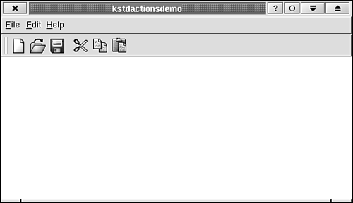
See Figure 5.2 for a screen shot of KStdActionsDemo. | |
The standard actions certainly won't be all the actions you'll need for all your applications; in this section you'll see how to create custom actions and incorporate them into your application's UI. Listings 5.4–5.7 present KCustomActions, a top-level widget that demonstrates how to use a few custom actions.
Example 5.4. kcustomactions.h: Class Declaration for KCustomActions 1
2 1: #ifndef __KCUSTOMACTIONS_H__
3 2: #define __KCUSTOMACTIONS_H__
4 3:
5 4: #include <ktmainwindow.h>
6 5:
7 6: class KToggleAction;
8 7: class KRadioAction;
9 8:
10 9: /**
11 10: * KCustomActions
12 11: * Create custom actions for the menubar and toolbars.
13 12: **/
14 13: class KCustomActions : public KTMainWindow
15 14: {
16 15: Q_OBJECT
17 16: public:
18 17: /**
19 18: * Construct the menubar and toolbars and fill
20 19: * them with interesting things.
21 20: **/
22 21: KCustomActions (const char *name=0);
23 22:
24 23: public slots:
25 24: void slotMyEntry();
26 25: void slotLoadPage (const QString &url);
27 26: void slotRectangle ();
28 27: void slotPencil ();
29 28:
30 29:
31 30: protected:
32 31: KToggleAction *checkable;
33 32: KRadioAction *rectangle, *pencil;
34 33: };
35 34:
36 35: #endif
37 |
As in KStdActionsDemo, you declare a constructor, some slots to respond to the actions, and classwide pointers (lines 31 and 32) to some actions. Here you use two new action types: KToggleAction and KRadioAction. They are discussed following Listing 5.5.
Example 5.5. kcustomactions.cpp: Class Definition for KCustomActions 1
2 1: #include <stdio.h>
3 2:
4 3: #include <qpopupmenu.h>
5 4: #include <qkeycode.h>
6 5:
7 6: #include <kmenubar.h>
8 7: #include <ktoolbar.h>
9 8: #include <kiconloader.h>
10 9: #include <kaction.h>
11 10: #include <kstdaction.h>
12 11: #include <kapp.h>
13 12:
14 13: #include "kcustomactions.moc"
15 14:
16 15: //Widget IDs for URLToolBar
17 16: const int URLLabel =0,
18 17: URLCombo=1;
19 18: KCustomActions::KCustomActions (const char *name) : KTMainWindow (name)
20 19: {
21 20: new KAction ("Specia&l", CTRL+Key_L, 0L, 0L,
22 21: actionCollection(), "special");
23 22: KStdAction::quit (kapp, SLOT(closeAllWindows()), actionCollection());
24 23:
25 24: KStdAction::home (0L, 0L, actionCollection());
26 25:
27 26: new KAction ("My &Entry", 0,
28 27: this, SLOT (slotMyEntry()), actionCollection(),
29 28: "my_entry");
30 29:
31 30: checkable = new KToggleAction ("My Checkable Entry", 0,
32 31: actionCollection(), "my_checkable_entry");
33 32:
34 33: KAction *grayentry =
35 34: new KAction ( "My &Gray Entry", "flag",
36 35: 0, 0L, 0L, actionCollection(),
37 36: "my_gray_entry" );
38 37: grayentry->setEnabled (false);
39 38:
40 39: //Create toolbox.
41 40:
42 41: rectangle =
43 42: new KRadioAction ("Rectangle select",
44 43: "rectangle_select", 0,
45 44: this, SLOT (slotRectangle()),
46 45: actionCollection(), "rectangle");
47 46: rectangle->setExclusiveGroup ("tools");
48 47:
49 48: pencil =
50 49: new KRadioAction ("Pencil",
51 50: "pencil", 0,
52 51: this, SLOT (slotPencil()),
53 52: actionCollection(), "pencil");
54 53: pencil->setExclusiveGroup ("tools");
55 54:
56 55: rectangle->setChecked(true);
57 56:
58 57: createGUI();
59 58: toolBar("toolBoxToolBar")->setBarPos (KToolBar::Left);
60 59:
61 60:
62 61: //Create second toolbar.
63 62:
64 63: QLabel *label = new QLabel ("URL:" toolBar("URL:,ToolBar");
65 64:
66 65: toolBar("URLToolBar")->
67 66: insertWidget (URLLabel, label->sizeHint().width(), label);
68 67:
69 68: int indexcombo =
70 69: toolBar("URLToolBar")->
71 70: insertCombo (QString("http://www.kde.org"),
72 71: URLCombo, true,
73 72: SIGNAL (activated (const QString &)),
74 73: this, SLOT (slotLoadPage (const QString &)));
75 74:
76 75: toolBar("URLToolBar")->setItemAutoSized (indexcombo);
77 76:
78 77:
79 78:
80 79: QLabel *dummyclientarea = new QLabel (this);
81 80: dummyclientarea->setBackgroundColor (Qt::white);
82 81: setView (dummyclientarea);
83 82:
84 83: }
85 84:
86 85: void
87 86: KCustomActions::slotMyEntry()
88 87: {
89 88: printf ("Custom->My Entry\n");
90 89: }
91 90:
92 91: void
93 92: KCustomActions::slotLoadPage(const QString &url)
94 93: {
95 94: printf ("Load page: [%s]\n", (const char *)url);
96 95: }
97 96:
98 97: void
99 98: KCustomActions::slotRectangle ()
100 99: {
101 100: if (rectangle->isChecked())
102 101: printf ("Use rectangle select tool\n");
103 102: }
104 103:
105 104: void
106 105: KCustomActions::slotPencil ()
107 106: {
108 107: if (pencil->isChecked())
109 108: printf ("Use pencil select tool\n");
110 109: }
111 |
You create three menus in KCustomActions: the File menu, the Go menu (another standard menu), and a menu called Custom. Because a customized menu contains a set of application-specific functions, you need to create each of the corresponding actions "by hand" using KAction. You also create three differently styled toolbars. The File and Go menus have predefined, KDE-wide layouts, so the actions on these menus will be put in their proper order in the menus and on the main toolbar, but you can also add application-specific entries to these menus. This is demonstrated with the action called Special created on lines 20 and 21. In the statement on lines 20 and 21, you describe the action with the KAction constructor, but you don't specify on which menu this action belongs. The layout of nonstandard actions is specified in a separate file called kcustomactionsui.rc. This file is specified as the argument to and read by the createGUI() method (line 57). The method createGUI() merges this file, an XML file (given in Listing 5.6) with a global XML layout file, thereby merging your custom action layout with the global one to create a single layout for your application.
Example 5.6. kcustomui.rc: XML File Describing the Layout of the KCustomActions UI 1
2 1: <!DOCTYPE kpartgui>
3 2: <kpartgui name=kmenubardemo>
4 3: <MenuBar>
5 4: <Menu name=file><text>&File</text>
6 5: <Action name=special/>
7 6: </Menu>
8 7: <Menu name=custom><text>&Custom</text>
9 8: <Action name=my_entry/>
10 9: <Action name=my_checkable_entry/>
11 10: <Action name=my_gray_entry/>
12 11: </Menu>
13 12: </MenuBar>
14 13: <ToolBar name=mainToolBar>
15 14: <Action name=my_gray_entry/>
16 15: </ToolBar>
17 16: <ToolBar name=toolBoxToolBar>
18 17: <Action name=rectangle/>
19 18: <Action name=pencil/>
20 19: </ToolBar>
21 20: <ToolBar name=URLToolBar/>
22 21: </kpartgui>
23 |
The file in Listing 5.6 is used to specify where actions should be placed on the menus and toolbars, using a predefined set of XML tags. XML stands for eXtensible Markup Language, a subset of SGML created to simplify the storage and transmission across platforms of structured data. The words in angle brackets (such as <MenuBar>) are called tags, and they usually come in pairs, such as: <MenuBar>…</MenuBar>. The pair serves to delimit the beginning and the end of a section. In the case of the <MenuBar>…</MenuBar> tags, the information between the tags describes the layout of the menubar.  | XML files may remind you of HTML. That's because they both are types of SGML, the Standard Generalized Markup Language. All SGML files use tags in angle brackets for markup and have a similar markup format. |
Some of the tags have attributes, which are of the form For example, name=custom is an attribute of the <Menu> tag used in Listing 5.6. Finally, some tags do not come in pairs because no more information is needed to describe them than what is given in their tag name and/or tag attributes. Such a tag in Listing 5.6 is <Action name="actionname"/>. Table 5.1 shows a list of the tags that are available for use in creating these KDE GUI XML files. (The file type is specified by the tag <!DOCTYPE kpartgui>. The name comes from the fact that these documents originated in the KParts component architecture. (See Chapter 12, "Creating and Using Components (KParts)" for more information on KParts).
Table 5.1. XML Tags Used by kpartgui Files | Tag/Tag Pair | Use/Content |
|---|
| <MenuBar></MenuBar> | Description of the menubar | | <Menu name=name></Menu> | Description of a menu named name (name is not displayed) | | <text></text> | Menu title to display in the menubar | | <ToolBar name="name"></ToolBar> | Description of the toolbar named name (name is not displayed) | | <Action name="name"/> | Put an action on a menu or toolbar. This tag falls between <Menu></Menu>tags or <ToolBar></ToolBar>tags. The string name is the same string that is passed as the last argument to the KAction constructor. |
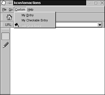
Now back to KCustomActions. The action called "special" is described on line 5 of Listing 5.6 with and created on lines 21 and 22 of Listing 5.5. Notice that the string special is used in both places. The method createGUI() uses this string to match actions to their corresponding XML tags. This action will be inserted in the File menu in the proper place according to the KDE UI standard because you have placed the action tag inside the tags <Menu name="file"></Menu>. The name identifier used here is defined in the global XML KDE UI description file. You should take a look at this file to see which menus are available and what names they are given. The file is $KDEDIR/share/config/ui/ui_standards.rc. The next menu, called Custom, contains three entries. It is shown in Figure 5.3. The first entry, called My Entry, is created in lines 27–29 of Listing 5.5. The second entry is called a checkable entry because it may or may not have a check mark placed next to it. Checkable menu entries are created with KToggleAction (see lines 31 and 32). The user may toggle a frequently changed option by selecting the corresponding entry from a menu. The check mark indicates whether the option is on or off. You do not specify a slot in the call to the KToggleAction constructor because there is no event to which to respond. When you need to know whether the option is on or off, you can check the value returned by checkable->isChecked(). The last entry in the Custom menu is a disabled entry (see lines 34–48). The entry is marked as disabled by calling setEnabled (false), as shown on line 38. Using disabled entries lets the user see all the functions that are included in the application, even if they aren't currently appropriate or usable. For example, a commonly disabled entry in the File menu is Save. This entry would be disabled (and displayed in a different style that would indicate to the user that it is disabled) until a document is actually opened (perhaps even until the document is changed).  | Historically, disabled menu entries were shown in gray type instead of black. Today, displays have 24-bit color and GUIs are highly configurable and themeable; therefore, disabled entries, although still visually distinguishable from enabled entries, are often styled in a way that is not simply gray (for example, KDE uses a semi-transparent effect by default). |
Lines 41–58 create a "toolbox" toolbar. This toolbar contains a set of radio buttons representing different tools that can be used to edit the document. You have created a rectangle-select tool button and a pencil tool button. The nature of radio buttons is that only one button can be pressed down at a time (that is, the user can use only one tool at a time). You can create radio buttons with KRadioAction. Each time you create one of these buttons, you insert it into a group with the method setExclusiveGroup ("name") (see lines 46 and 53 of Listing 5.5). You can use any name you like, just be sure to use the same name for every button in a single radio-button group. These toolbox buttons are placed on a separate toolbar that is named toolBoxToolBar on line 13 of Listing 5.6.  | You can lay out multiple toolbars with your XML KDE UI file and createGUI(). |
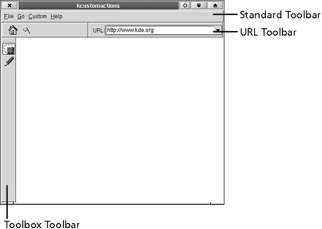
The toolbox is moved to the left side of the window (a common place to find a toolbox) on line 51 of Listing 5.5. When you need to access the toolbar widget directly, as done here, use the KTMainWindow method toolBar (name), which returns a pointer to the toolbar named name. The identifier name is the same one used to declare the toolbar in the XML GUI file; therefore, on line 16 of Listing 5.6, you see the toolbox toolbar declared with and on line 58 of Listing 5.5, the same toolbar is referenced with The final toolbar, the URL toolbar, holds a text label and a combobox. Figure 5.4 shows all the toolbars. Because text display and text entry aren't really actions, there are no corresponding KAction subclasses. So how do you make the toolbar? One answer is to create your own subclasses of KAction—perhaps KTextLabelAction and KComboAction—and create the toolbar with an XML UI file and createGUI(). This method, although a little extra work, provides your application with more configurability. The simpler method is to create them by directly accessing the KToolBar widget (the now old-fashioned way). After setting up the UI with a call to createGUI(), add the extra URL toolbar. This toolbar has id=2 and the corresponding KToolBar widget is created with the first call to the method toolBar() on line 52 of Listing 5.5. Lines 55–75 insert two widgets, the static text label (a QLabel), and the combobox into the toolbar. See the KToolBar documentation for details of these methods.
Example 5.7. kcustomactions.h: The Class Definition for KCustomActions
   1
   2  1: #ifndef __KCUSTOMACTIONS_H__
   3  2: #define __KCUSTOMACTIONS_H__
   4  3:
   5  4: #include <ktmainwindow.h>
   6  5:
   7  6: class KToggleAction;
   8  7: class KRadioAction;
   9  8:
  10  9: /**
  11 10:  * KcustomActions
  12 11:  * Create custom actions for the menubar and toolbars.
  13 12:  **/
  14 13: class KCustomActions : public KTMainWindow
  15 14: {
  16 15:   Q_OBJECT
  17 16:  public:
  18 17:   /**
  19 18:    * Construct the menubar and toolbars and fill
  20 19:    *  them with interesting things.
  21 20:    **/
  22 21:   KCustomActions (const char *name=0);
  23 22:
  24 23:  public slots:
  25 24:   void slotMyEntry();
  26 25:   void slotLoadPage (const QString &url);
  27 26:   void slotRectangle ();
  28 27:   void slotPencil ();
  29 28:
  30 29:
  31 30:  protected:
  32 31:   KToggleAction *checkable;
  33 32:   KRadioAction *rectangle, *pencil;
  34 33: };
  35 34:
  36 35: #endif
37 |
Listing 5.7 declares the constructor, slots to process actions, and variables to keep track of actions (lines 31 and 32). For example, in slotRectangle() on line 100 of Listing 5.5, refer to the object rectangle to see whether the slot was called in response to the user choosing this tool or deselecting it by choosing another tool. The following main() function can be used to try out KCustomActions. (For simplicity, you have not created an instance of KAboutData. However, you always should for any application you intend to distribute.)
Example 5.8. main.cpp: A main() Function Suitable for Testing KCustomActions 1
2 1: #include <kapp.h>
3 2:
4 3: #include "kcustomactions.h"
5 4:
6 5: int
7 6: main (int argc, char *argv[])
8 7: {
9 8: KApplication kapplication (argc, argv, "kcustomactions");
10 9: KCustomActions *kcustomactions = new KCustomActions;
11 10:
12 11: kcustomactions->show();
13 12: return kapplication.exec();
14 13: }
15 |
| |
| |
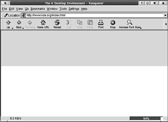
The statusbar gives the user information about what the application is doing, what it has just completed, or what it might do if the user asks it to perform a task. Let's look at two examples: Konqueror and KWrite. Figure 5.5 shows Konqueror just after pressing Enter in the line editor in the toolbar. The statusbar indicates what Konqueror is doing—loading the page at "8.0 KB/s." It also says what it has done: loaded 94% of the page so far. When the loading is complete, the statusbar says Document: Done. Also, when the user passes the mouse cursor over a link, the statusbar displays the full URL pointed to by the link. This shows to what page the link would bring the user. | |
The statusbar used in KWrite contains status indicators that are always present at the right side of the statusbar (see Figure 5.1). They tell the user whether the file needs saving (the asterisk indicates "yes"), whether the user is in insert or overwrite mode, and which line and column the cursor is on. Now create your own example. Listings 5.9–5.11 present code for KStatusBarDemo, an application that demonstrates KStatusBar.
Example 5.9. kstatusbardemo.h: Contains the Class Declaration for KStatusBarDemo, a Subclass of KTMainWindow 1
2 1: #ifndef __KSTATUSBARDEMO_H__
3 2: #define __KSTATUSBARDEMO_H__
4 3:
5 4: #include <ktmainwindow.h>
6 5:
7 6: class QPopupStatus;
8 7:
9 8: /**
10 9: * KStatusBarDemo
11 10: * Demonstrates functions of KStatusBar.
12 11: **/
13 12: class KStatusBarDemo : public KTMainWindow
14 13: {
15 14: Q_OBJECT
16 15: public:
17 16: /**
18 17: * Construct the statusbar and fill it with interesting things.
19 18: **/
20 19: KStatusBarDemo (const char *name=0);
21 20:
22 21: public slots:
23 22: void slotChangeMode ();
24 23:
25 24: protected:
26 25: bool mode;
27 26:
28 27: };
29 28:
30 29: #endif
31 |
Example 5.10. main.cpp: Contains a main() Function That Creates and Executes kstatusbardemo, an Application Based on KStatusBarDemo 1
2 1: #include <kapp.h>
3 2:
4 3: #include "kstatusbardemo.h"
5 4:
6 5: int
7 6: main (int argc, char *argv[])
8 7: {
9 8: KApplication kapplication (argc, argv, "kstatusbardemo");
10 9: KStatusBarDemo *kstatusbardemo = new KStatusBarDemo;
11 10:
12 11: kstatusbardemo->show();
13 12: return kapplication.exec();
14 13: }
15 |
The statusbar in this example is a simple one. There are two areas: one for a general status message and one for a mode indicator (similar to the INS/OVT indicator used by KWrite).
Example 5.11. kstatusbardemo.cpp: Contains the Class Definition for KStatusBarDemo 1
2 1: #include <kstatusbar.h>
3 2: #include <kapp.h>
4 3: #include <kstdaction.h>
5 4: #include <kaction.h>
6 5:
7 6: #include "kstatusbardemo.moc"
8 7:
9 8: //Status bar IDs.
10 9: const int StatusBarMain = 0, StatusBarMode = 1;
11 10:
12 11: KStatusBarDemo::KStatusBarDemo (const char *name) : KTMainWindow (name)
13 12: {
14 13: KStdAction::quit (kapp, SLOT(closeAllWindows()), actionCollection());
15 14: new KAction ("&Change Mode", 0,
16 15: this, SLOT (slotChangeMode()), actionCollection(),
17 16: "change_mode");
18 17:
19 18: createGUI();
20 19:
21 20: statusBar()->
22 21: insertItem ("Current status of application",
23 22: StatusBarMain, 1);
24 23: statusBar()->insertItem (" Mode2 ", StatusBarMode);
25 24: statusBar()->changeItem (" Mode1 ", StatusBarMode);
26 25: mode=true;
27 26:
28 27: statusBar()->message ("Application is ready!", 2000);
29 28:
30 29: QLabel *dummyclientarea = new QLabel (this);
31 30: dummyclientarea->setBackgroundColor (Qt::white);
32 31: setView (dummyclientarea);
33 32: }
34 33:
35 34:
36 35: void
37 36: KStatusBarDemo::slotChangeMode ()
38 37: {
39 38:
40 39: if (mode)
41 40: {
42 41: statusBar()->changeItem (" Mode2 ", StatusBarMode);
43 42: mode=false;
44 43: }
45 44: else
46 45: {
47 46: statusBar()->changeItem (" Mode1 ", StatusBarMode);
48 47: mode=true;
49 48: }
50 49:
51 50: }
52 |
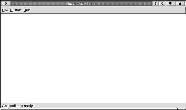
In the KStatusBarDemo constructor, you first create a simple menubar containing an entry that will be used to change the mode displayed by the mode indicator. This is done in lines 14–16 of Listing 5.10. See Figure 5.6 for a screen shot. (The call to create GUI() on Line 18 looks for a file called kstatusbardemoui.rc in the directory $KDEDIR/share/kstatusbardemo. This file is available on the Web site.) The mode indicator should take up a fixed amount of the statusbar and be positioned on the far right. The main message area should take up the rest of the statusbar. To partition the statusbar in this way, the mode indicator is created with a stretch value—the third argument to insertItem()—of 0, meaning to use as little space as possible (see line 23), and the main message area is created with a stretch value of 1. When the stretch value is nonzero, it tells KStatusBar to apportion the statusbar width among the various items in amounts proportional to stretch. When stretch is zero, KStatusBar always uses the width of the text field with which the item is created. On line 23 the mode indicator is created with the text Mode2 because this is the longer of the two possible text strings that this field will hold. In general, when the item you are inserting has a stretch value of zero, you should always call insertItem() with the longest text string that field will hold to be certain that there will be enough space to fit any of the text strings. The method KStatusBar::message() (see line 27) displays a temporary message on top of the entire statusbar. The message "Application is ready!" remains visible for two seconds. The second argument tells how long, in milliseconds, the message will be visible. After it disappears, the items placed in the statusbar with insertItem()appear. | |
| |
The look and function of the content area varies from application to application. The goal in designing the content area is to convey some of or all the information contained in the document (where "document" is somewhat loosely defined) to the user. If all the information cannot be displayed, the user should be able to browse or search for more. You may also want to allow the user to change (edit) the document. The style and complexity of this portion of the interface is strongly influenced by the character of the document being presented. But always remember to keep it simple. Next, you see how some common applications implement their content areas. KWrite deals with the most obvious of documents—a text file. It displays an empty (usually white) rectangle with a blinking text-insertion cursor (and I-shaped cursor). The user types and sees the typed characters appear as text in the window. The user can edit the text using standard keys (Arrows, Backspace, Delete, and so on). When the text becomes too large for the window, a horizontal or vertical scrollbar appears (whichever is necessary), giving access to the unseen portions of the document. KWrite can be seen in Figure 5.1. KWrite uses a custom-made widget for displaying and editing its documents. KDE applications can use either the KEdit or QMultiLineEdit class for displaying and editing text in their client areas. | |
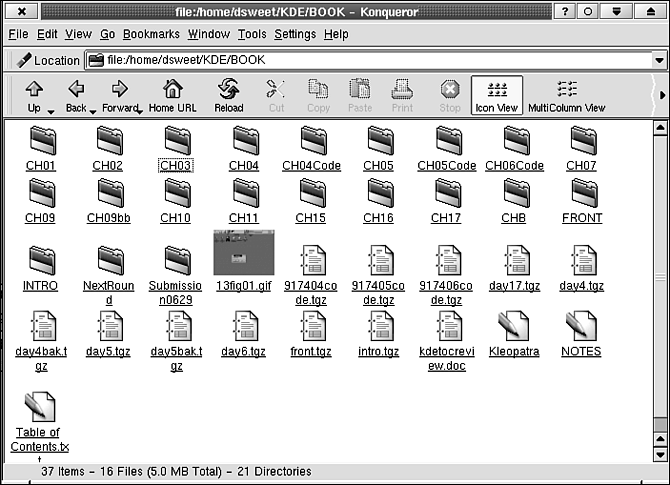
Figure 5.7 shows Konqueror displaying the contents of a directory, which is the "document" in this case. The user uses the scrollbars to see more of the directory. The user edits the "document" by adding, deleting, or renaming files or subdirectories. Of course, Konqueror also allows navigation between documents. If you click a folder, you see its contents. If you click an HTML file, you see it rendered. FTP sites can be displayed, navigated, and so on, just like local directories. If you click a PostScript file, you will see it rendered (in the same client area, but by a different application, KGhostView), and so on. Konqueror's view is so powerful because it displays information using components—embedded applications—so that, in principle, any URL can be handled within Konqueror if a component is available to display it. | |
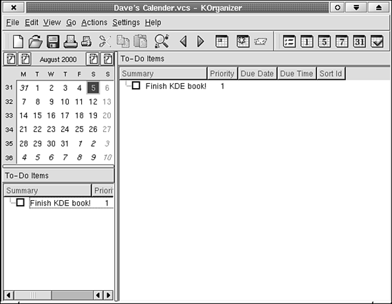
The KOrganizer client area consists of three parts and is shown in Figure 5.8. On the left are the calendar and the To-Do list. On the right is the list of appointments for a given day. The calendar is used to navigate to different days and the navigator is placed to the left, as is customary. The To-Do list is presumably placed here to keep it always in view because it may contain more urgent information. KOrganizer uses QSplitter to divide the left side from the right side. The vertical frame drawn by QSplitter can be dragged from left to right to change the layout of the client area. | |
| |
| |
